Top Juice
Emphasis on quality, capturing the goodness within.
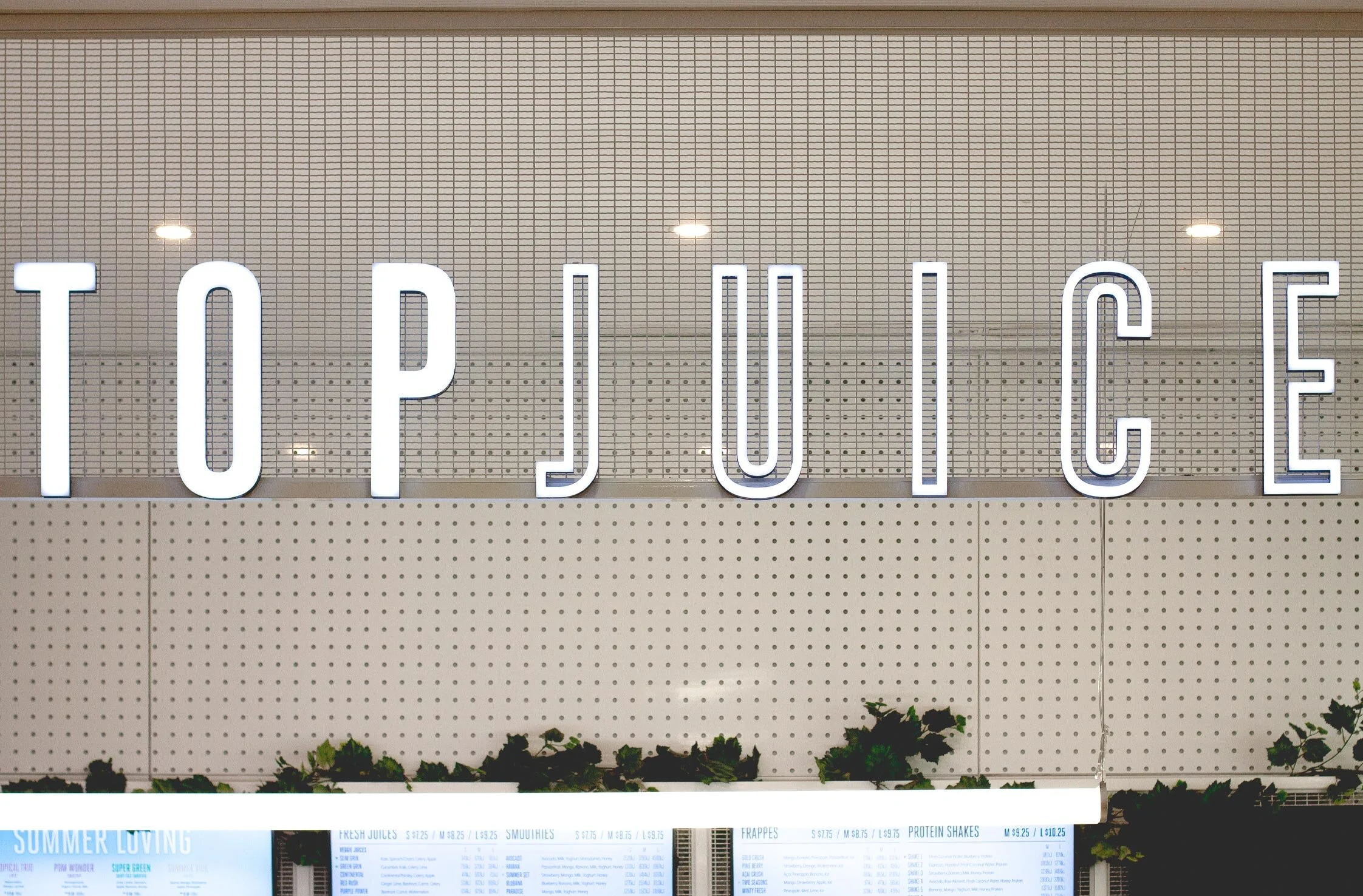
The aim was to modernise and consolidate Top Juice’s brand collateral and consumer touch points without completely losing touch with their existing brand values. With an existing logo that needed refreshing and driven by their new store interiors, the updated branding was a step up for Top Juice, making it fresh, contemporary and relevant in a very competitive market place.
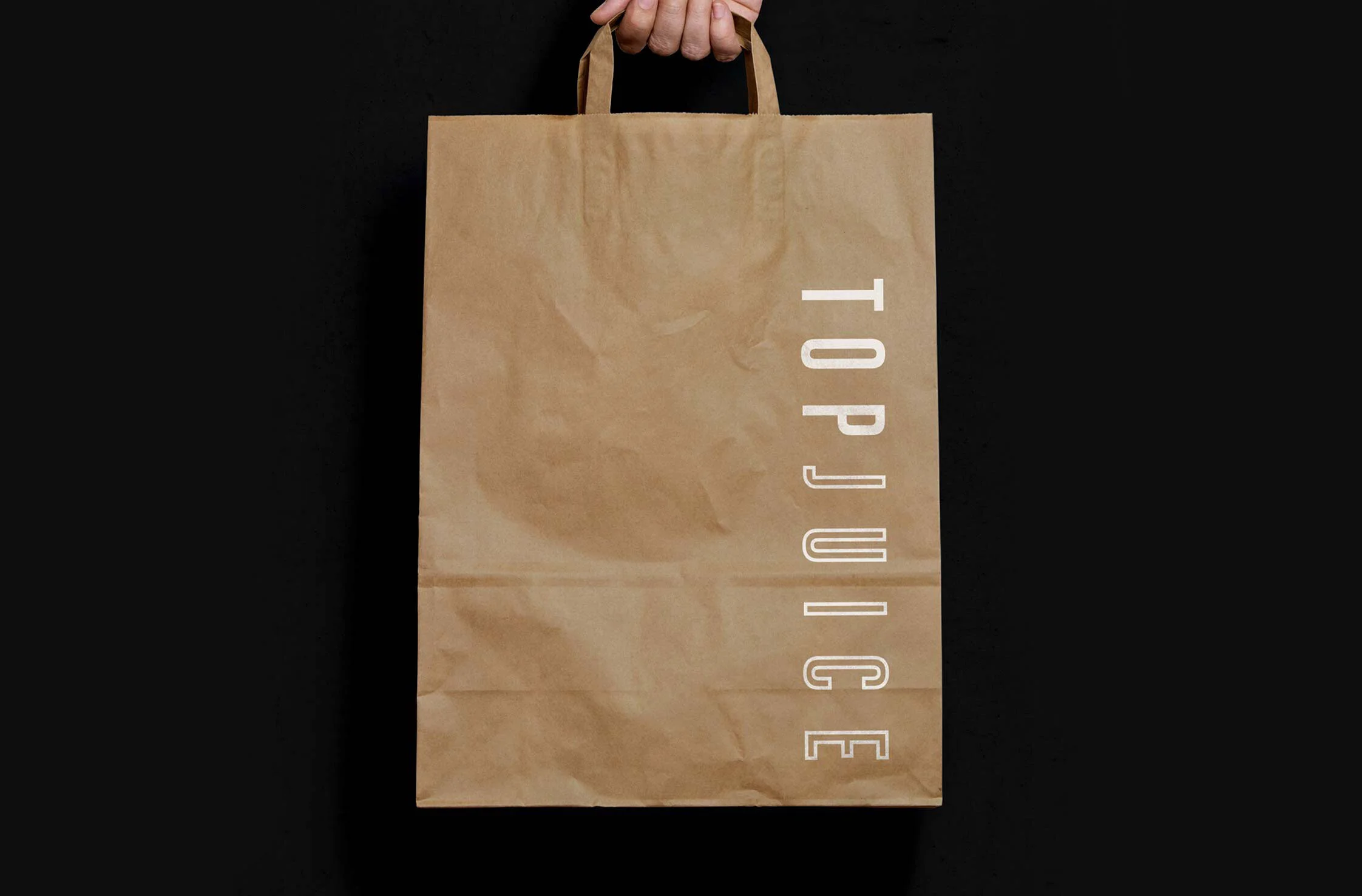
The new identity is more refined with a clean typographical treatment and a neutral colour palette, allowing the colours and texture of their high quality products to come to the fore, focusing on the goodness within. This is particularly evident when seen on packaging and instore.
Scope of works:
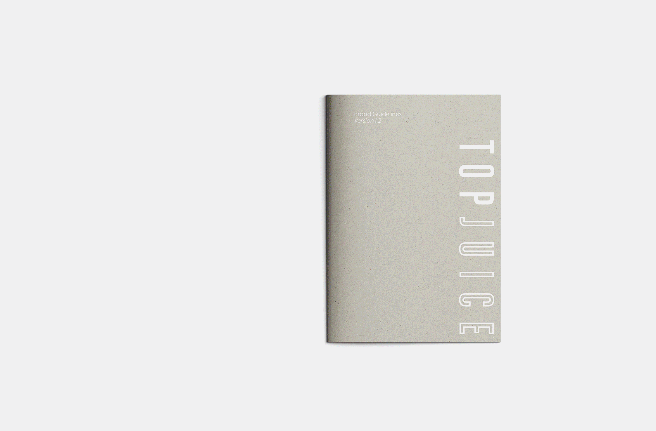
Logo / Typography / Brand Colour Palette / Photographic Style / Packaging / Promo Templates / Stationery / Menu / Brochure Templates / Signage / Wayfinding / Ticketing / Environmental Graphics / Brand Guidelines